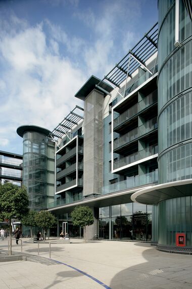
- Chetwood Architecs
Sainsbury's Maidenhead
Some call this string of towns just outside London the ‘Silicone Corridor’; Reading, Slough and Maidenhead, nestled along the M4 motorway, produce a fair share of the country’s computer software. They aren’t known for their beauty, but for the business which makes the southeast of England much more prosperous than the rest of the country. Mostly boxy-looking business parks and office blocks line the streets in and out of these towns which have recently become internationally famous, maybe even infamous, through a comedy series, ‘The Office’ satirising the drab life of white collar workers in the ‘Silicone Corridor’ and its business sheds. Until recently the northern town centre of Maidenhead satisfied the cliché of the uninspired and unremarkable which many might associate with the town. A little more than a stone’s throw from the Town Hall and High Street, the site was truly grim; it featured a hostile looking red brick colossus of a Sainsbury’s supermarket with a mini office annex, and not one, but two car parks to the side. And while central, the site’s location had a major set back: to the north the city’s ring road truncates movement and views to the outlying areas of Maidenhead. Five years ago Sainsbury’s embarked on a major redevelopment scheme for this area. Offices, the supermarket and one car park were demolished. The new scheme featured the same uses plus housing, but much reconfigured; Sainsbury’s were keen to build a bigger store, and the local authority wanted to hang on to the car parking. An office building – much larger this time was planned, alongside some 150 units of housing which helped to finance the project.
APPROACH
The architects, London-based Chetwood Associates, had to approach this project initially as town planners. The site desperately needed a better link to the town centre, and larger public spaces were required to lend some quality and visual breathing space to the project. Those tasks were achieved by stacking up uses rather than spreading them out: the supermarket now forms the base of a major new building, with five floors of car parking above which in turn are embraced by an outer layer of flats. This approach leaves space for a wide pedestrian area to the side. The micro climate of this site produced a headache for the architects: how to dress up and insulate a building which has to deal with four different environments? There is the tough reality of a major road on one side, some low scale housing on another, a large public square to the third and the retained car park on the fourth side. Chetwood’s needed a flexible approach to their façades, and decided to work with Reynaers Aluminium who had proved successful collaborators during the Millennium project of a new Sainsbury’s store in London’s Greenwich.
SHOPFRONT
Greenwich was conceived as an environmentally ‘green’ supermarket, and is virtually covered by sloping grass banks. This does not sound like a great opportunity for Reynaers but one relatively small yet hugely important area of the building needed glazing; the ‘shop front’ as Paul Hunter from Chetwood’s describes the beautiful eye-shaped opening into the store, is fully glazed and elegantly curved. The project was a tremendous success, and awards for Greenwich occupy several shelves in Chetwood’s office foyer, including an ‘Aluminium Imagination Award’ given in 2001 by the Aluminium Extruders Association. In Maidenhead, the ‘shopfront’ area proved a challenge: rather than facing the town centre, the planning department at the local authority pressed for it to be on the north side of the building, so that customers would traverse the public space to the side. This meant that the double height entrance area had to face the ring road, and Chetwood’s needed a product which could provide thermal insulation and elegance at the same time. The entrance was crucial to Sainsbury’s who clearly wanted to avoid the mistakes of the past and instead be transparent and inviting. Reynaers’ CW 50-SC glazing is a convincing solution; it follows the building’s curve and works without clumsy capping on the outside. The flats were fitted with Reynaers’ CS 68 system which was chosen for its high performance and good insulation values. The project shows the flexibility of a varied architectural approach to which Reynaers products can be incorporated. And hopefully forms part of the beginning of a more exciting future for Maidenhead.
Used systems
Involved stakeholders
Architect
- Chetwood Architecs
Fabricator
- Spec-Al
Photographer
- Nick Short Photography
Other stakeholder
- HBG (General contractors)
- Sainsbury's (Investors)


